Health bar final choice + Steam game festival event!
HP BAR
First of all, we want to thank everyone who gave their feedback about the new health bar mockup! It has been a fun experience seeing so much discussion!
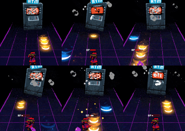
After looking at discussions and doing a lot of testing Chris and I decided to keep the hp bar above the player.
We first did some adjustments like reducing the width size of the bar and further polishing the art assets so it reads better!

better gif quality here: https://imgur.com/a/ZofANtF
Not only does it make the game viewport feel more cleaner but it also helps the player to have all important information in one place and with the visuals shrunk a bit it works well in more hectic battles with more notes/projectiles SPOILERS! 
STEAM GAME FESTIVAL EVENT

We are going to participate in the steam game festival event!
It’s a show of games set to be released within this and the next year.
But best of all
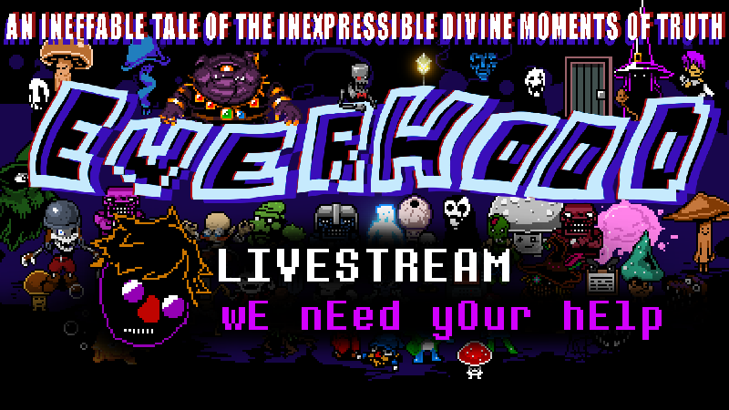
We plan to do a Livestream Thursday 18 at 8 PM CEST and also do a live chat this same day at 10 PM CEST

Make sure to tune into the Livestream as we are preparing a little challenge that will be very amusing!
Livestream reminder link :
https://steamcommunity.com/games/1229380/announcements/detail/226131722289826785...https://steamcommunity.com/games/1229380/announcements/detail/2261317222898269976
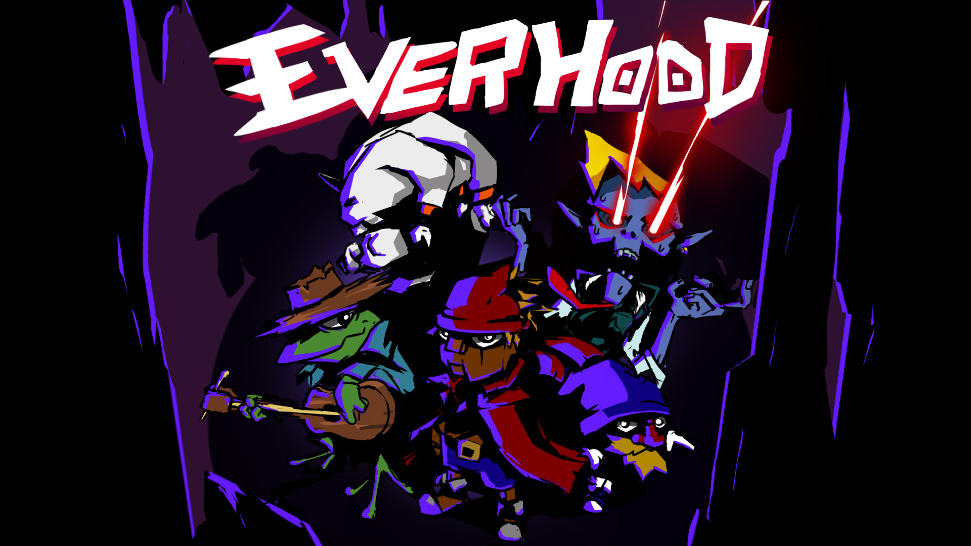
Cover art made by Roposhipin from discord!
Really cool render of Red and Blue, the posture has so much action and there really feels like a story is going on here
We added the health bar above just so to tie it up with the post a bit! :D
Wishlist us here so you don't miss any news:
Get Everhood
Everhood
| Status | Prototype |
| Author | EverhoodDev |
| Genre | Adventure, Rhythm, Role Playing |
| Tags | 2D, Experimental, Music, Mystery, Pixel Art, Top Down Adventure, Undertale |
| Languages | English |
More posts
- Everhood is OutMar 07, 2021
- EVERHOOD RELEASE DATE ANNOUCEMENTFeb 01, 2021
- The divine moments of creativityJan 27, 2021
- A look back into the dark timesJan 20, 2021
- Testing, fixing, testing and testingDec 30, 2020
- Hectic weeks and some thoughts!Dec 09, 2020
- Time to start wrapping up the game again!Nov 18, 2020
- Game engine version change and just polish, polish, polishOct 30, 2020
- Lot of work right now!Oct 09, 2020
- Yet another postSep 25, 2020

Leave a comment
Log in with itch.io to leave a comment.